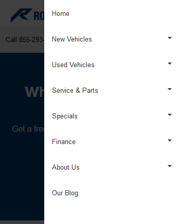
In our effort to continuously improve user experience across devices and overall website performance, we have released a new and improved navigation menu. The new navigation will dramatically improve user experience on tablets and mobile devices.
Improvements include:
- A cleaner look and feel
- A cleaner navigation menu and user experience on tablets in portrait orientation
- Faster opening / closing / expanding / collapsing
- Works identically on all browsers
- Native mobile sticky header (meaning as you scroll, the bar stays but the header with the logo goes away)